The Blockstream Corporate logo is an important expression of our brand identity. It should
in no way be distorted or redrawn when applied to communications.
Each product should use the colour logo on dark logo variation as the primary logo, when
this is not possible the monotone logo variations should be used instead. When a specific
use case requires a colour product logo on a light background the colour logo on light
version can be requested for single use.


Greyscale Logo
A monochrome version of the logo is only acceptable when media reproduction is limited. In these cases, the logo may be reversed to white only or black only. This applies to the product logos as well.


Alignment and Spacing
The emblemin the Blockstream corporate logo may be separated from the full logo and used on its
own. The individual emblem must always be accompanied by the company name or our other
product logos somewhere in the communications.
Likewise with the product logos the emblems may also be separated from the full logo and used on
its own. The individual product emblem must always be accompanied by the company name or the
Blockstream corporate logo somewhere in the communications.
Clear Space and Positioning
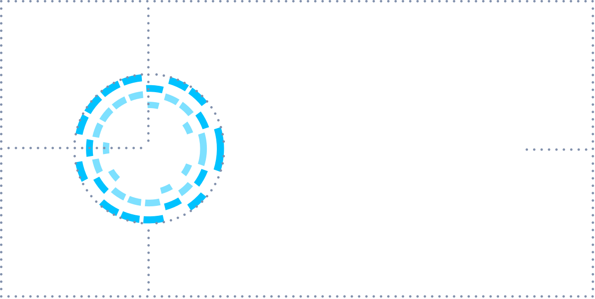
The logo should always be surrounded by generous white space. The minimum required space around the logo is equivalent to the radius of the symbol.
Incorrect Usage
Listed below are examples of incorrect usage of the Blockstream Corporate logo. These incorrect usage guidelines are also applied to the product logos.
- Do not change the size relationship of the symbol and the wordmark.
- Do not make the logo a single colour.
- Do not alter the colour of the symbol or the wordmark.
- Do not add effects such as drop shadows, gradients or glow.
- Do not use as a mask or holding shape for imagery.
- Do not place onto backgrounds with insufficient contrast to the logo.
- Do not rotate, skew, or shear.
- Do not distort proportions.
- Do not add text closely to the logotype to create another logo.






Partnerships
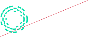
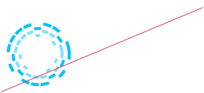
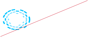
When pairing the Blockstream corporate logo or any other Blockstream logo with another logo, a thin line is used to separate the two logos. Ensure that each logo is visually balanced in terms of size. Ensure that the space between the logos and the line are visually equal on both sides of the line. Product logos may also be used following the same guidelines exampled here.

Live Demo
{% assign link_url = "https://blockstream.com/" %}
{% assign image_path = "https://blockstream.com/img/icons/logo_blks.png" %}
{% assign alt = "Logo" %}

<a class="logo" href="{{ link_url }}">
  <img src="{{ image_path }}" alt="{{ alt }}" />
</a>
{% include components/logo.html
link_url = "https://blockstream.com/"
image_path = "https://blockstream.com/img/icons/logo_blks.png"
alt = "Logo"
%}<a class="logo" href="https://blockstream.com/">
<img src="https://blockstream.com/img/icons/logo_blks.png" alt="Logo" />
</a>.logo {
img {
width: 150px;
}
}